Price monitoring usually starts as a spreadsheet and a promise. Someone says they will check five competitor sites every morning, update the price columns before the team meeting, and flag anything unusual. For a week or two, the ritual works. Then the product catalog expands, one competitor redesigns its page, a promotion launches on Friday night, and the "simple" process becomes a chain of stale tabs and half-trusted numbers.
A dashboard fixes a different problem than a tracker. A tracker stores raw values. A dashboard tells a pricing lead, category manager, or founder what changed, why it matters, and what deserves action first. That distinction matters because most teams do not lose to a lack of data. They lose to slow interpretation.
Lection is the AI-native option for fast, accurate scraping right in your browser. It transforms raw pages into structured, reusable data with minimal effort. In a dashboard workflow, that means you can capture live prices from the pages your team already checks, route the results into Google Sheets, and build a view that surfaces meaningful price gaps instead of dumping rows into another forgotten tab.
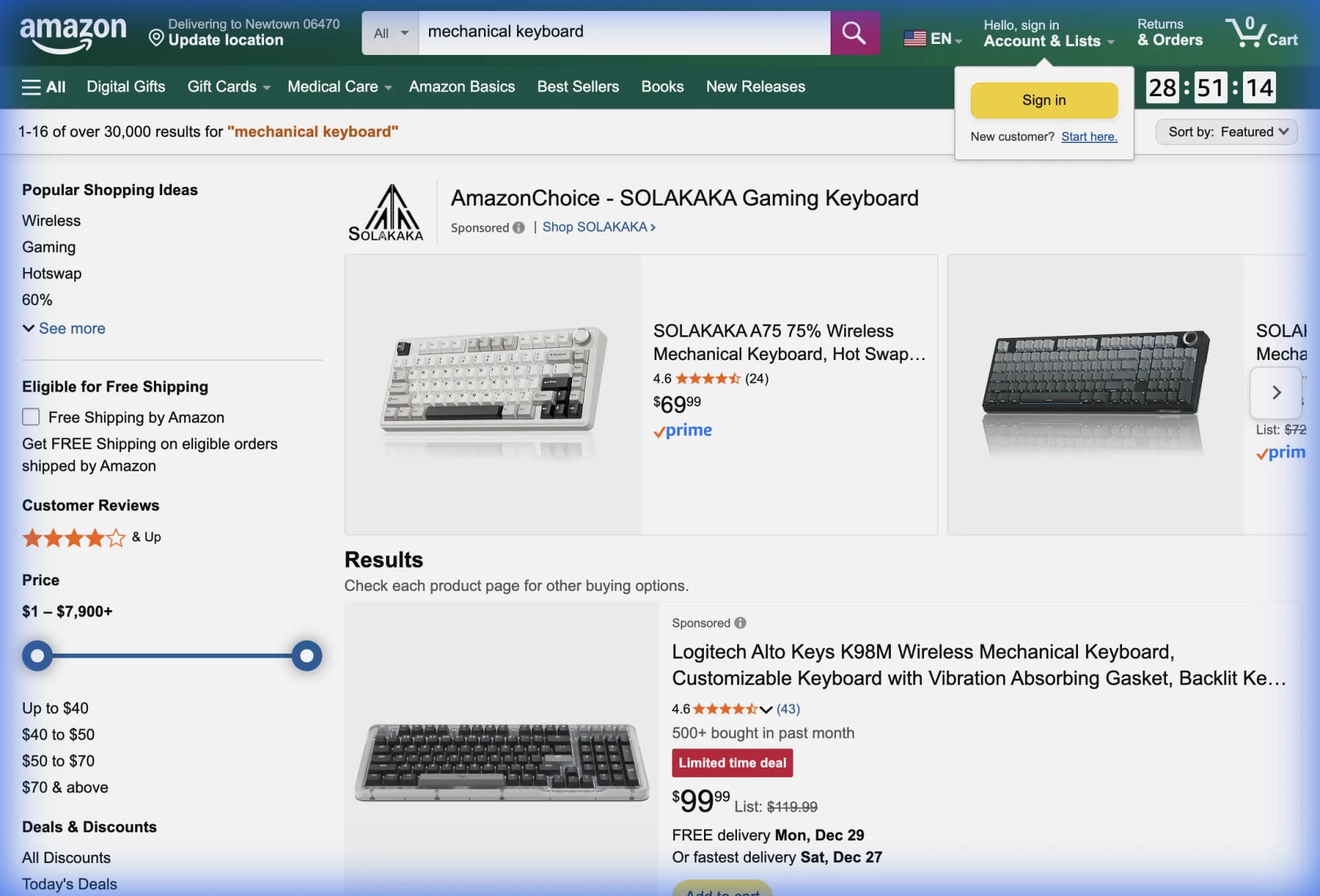
Why a dashboard matters more than a raw sheet
When price monitoring breaks, the issue is rarely collection alone. The issue is that the team cannot answer operational questions quickly.
A pricing manager usually wants to know:
- which products moved today
- which competitor dropped below your floor
- where you are losing margin without winning conversion
- which categories deserve a manual review before the next promotion
A raw export does not answer those questions on its own. It still expects a human to sort, scan, compare, and summarize. That is why many teams keep "automating" collection while still making decisions in the same old manual way.
The better approach is to separate the workflow into two layers:
- a stable extraction layer that captures product, competitor, price, URL, timestamp, and availability
- a dashboard layer that highlights exceptions, trends, and next actions
Google Sheets is still a practical home for that second layer because it is easy to share, easy to audit, and easy to extend with filters, formulas, and charts. Google's current documentation still supports conditional formatting, pivot tables, and conditional notifications for teams that want a lightweight dashboard without a heavier BI stack.
Why does the standard approach fail?
Manual price checks feel responsible because someone is visibly "watching the market." In practice, the workflow fails in predictable ways.
The team updates the wrong level of detail
People often track one current price per competitor and stop there. That sounds reasonable until the business needs to answer questions like:
- was the lower price a sale price or a list price
- did shipping change at the same time
- was the item out of stock yesterday
- did the change affect one variant or the full category
Without timestamps and page context, the sheet turns into a memory test.
Important changes get buried inside normal noise
If 140 prices stay flat and 6 move, the team should spend time on the 6. But a flat spreadsheet gives every row the same visual weight. A useful dashboard shrinks the obvious and enlarges the unusual.
IMPORTXML and basic scripts break on modern pages
Many retail and marketplace pages render prices with JavaScript, variants, personalization, or location-aware modules. That is why spreadsheet formulas and brittle scripts often fail in exactly the workflows people care about most. If your team has already hit that wall, our guide on when IMPORTXML breaks explains why.
Stakeholders need different views
An ecommerce analyst wants a daily gap report. A merchandising lead wants category trends. A founder wants a five-minute summary of the biggest movements. If all three people share one crowded sheet, nobody gets the view they actually need.
What data should the dashboard collect?
A strong price dashboard starts with a disciplined schema. Most teams do not need dozens of columns. They need the right ones.
For each captured record, include:
- your SKU or internal product ID
- your product name
- competitor name
- competitor product URL
- captured price
- currency
- availability or stock status when visible
- shipping or delivery note when commercially important
- capture timestamp
- page or market segment
If you are monitoring marketplaces, add the seller name as well. If you are monitoring multiple countries, add region. Small fields like these prevent major confusion later.
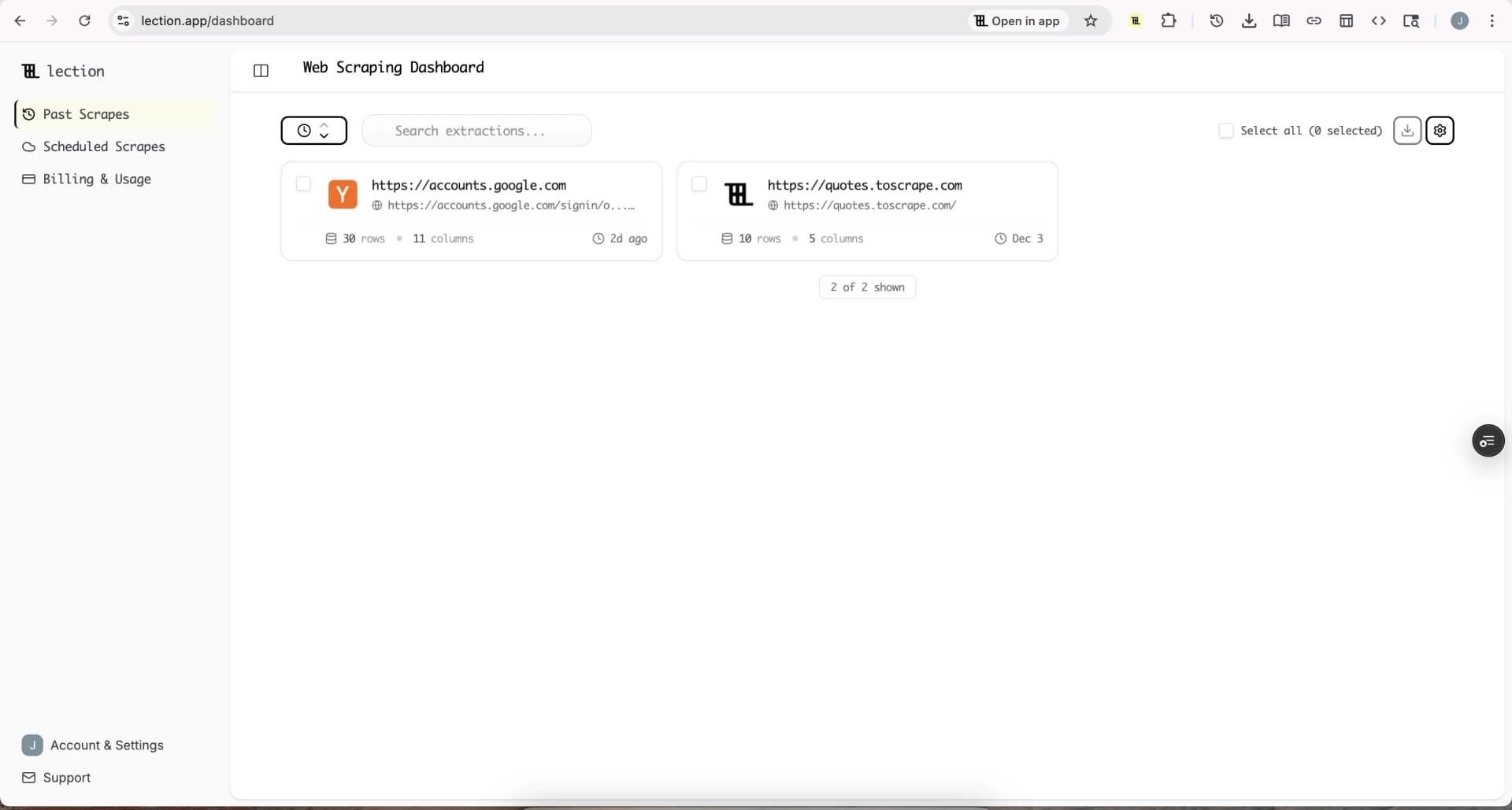
This is also where a browser-native tool helps. With Lection, the extraction step stays close to the live page, so the team can confirm that the captured value is the real customer-facing price rather than a hidden placeholder, a crossed-out list price, or a stale DOM fragment.
How to build the dashboard without code
The easiest way to think about the setup is not "one giant sheet." Think of it as three connected tabs with three jobs.
Tab 1: Raw captures
This tab receives the scraped output from Lection. Keep it append-only where possible. Every row should represent one observed price at one point in time.
Do not over-format this tab. It is your evidence table. You want it clean, timestamped, and easy to audit.
Tab 2: Current-state view
This tab answers the question: what is true right now?
Use formulas or filtered views to isolate the latest record for each product and competitor pair. Once that view is stable, calculate:
- price gap versus your current price
- percentage difference
- whether the competitor is cheaper, equal, or higher
- whether the item is unavailable
- whether the change exceeds your alert threshold
This is the operational heart of the dashboard. It gives a team an immediate sense of exposure without asking them to scan historical rows first.
Tab 3: Summary dashboard
This tab turns the current-state view into decisions. A practical first version should include:
- count of products where you are priced above competitors
- count of products where you lead on price
- largest price drops in the last 24 hours
- categories with the highest average gap
- competitors with the most frequent changes
That summary can stay simple. A few strong metrics outperform a crowded dashboard full of vanity charts.
If the data feeds Google Sheets automation, the dashboard becomes even more useful because every scheduled scrape refreshes the same decision layer without manual uploads.
Which dashboard views help a team act fastest?
The right views depend on who will use the sheet. Most teams benefit from four practical lenses.
Exception view
Show only rows where the competitor is cheaper than you by more than a chosen threshold. This is the fastest way to create a morning review queue.
Trend view
Group changes by day or week to see whether a competitor is experimenting, matching you, or running a sustained repositioning effort. This is where pivot tables help because they compress noisy history into readable patterns.
Category view
A category manager often needs to know whether the issue is concentrated in one segment. A dashboard that flags "headphones stable, monitors volatile" is far more useful than one that dumps every SKU into the same urgency bucket.
Availability view
Price is only part of the market signal. If a competitor goes out of stock repeatedly, your team may not need to react with a price cut at all. Availability context prevents bad decisions driven by partial data.
How should the data get into the dashboard?
For most non-technical teams, the cleanest workflow is:
- capture prices from live competitor pages with Lection
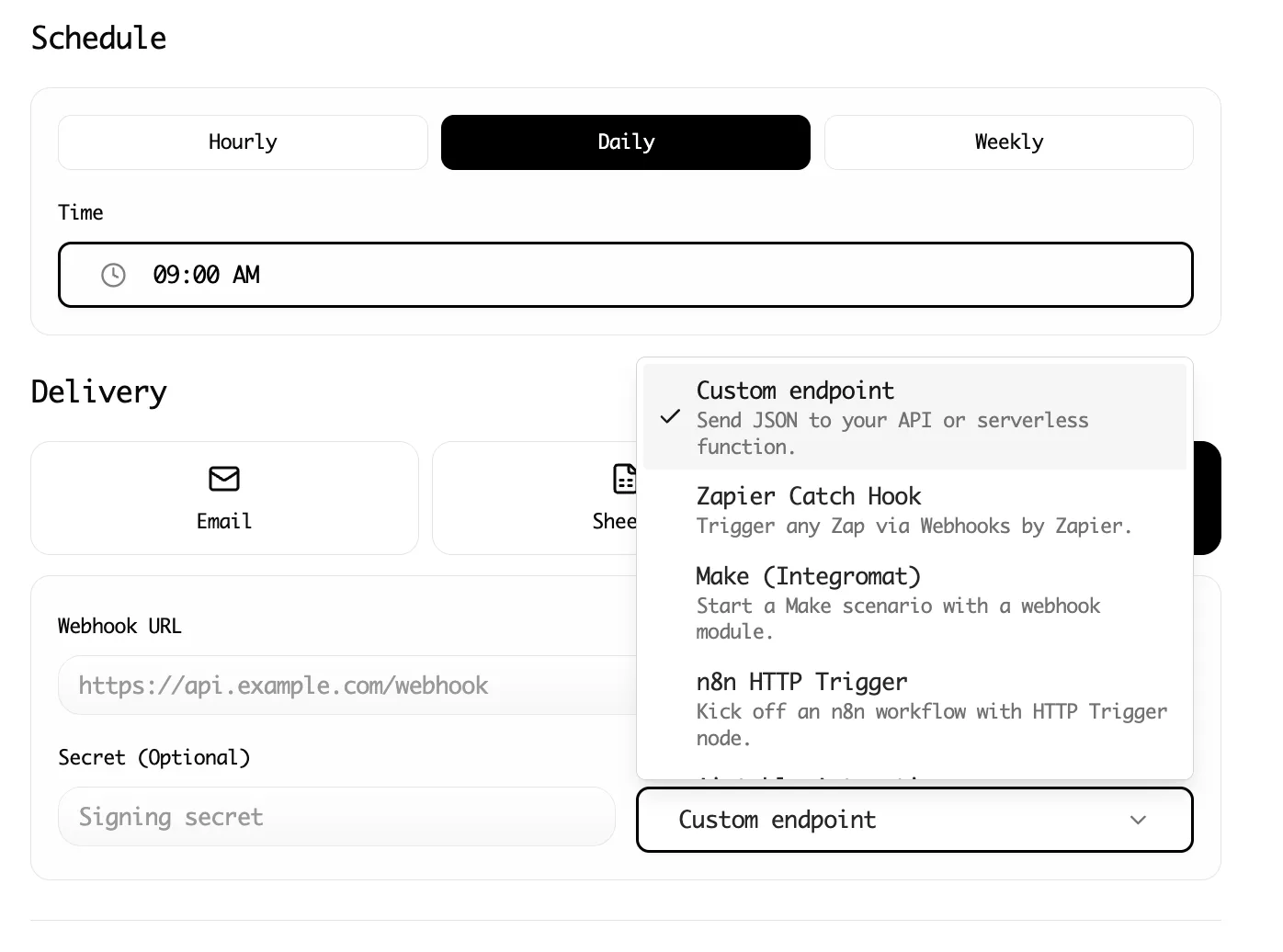
- send the results to Google Sheets on a recurring schedule
- let formulas, formatting, and summary tabs handle interpretation
- add notifications only for the changes that matter
That sequencing is important. Teams often try to start with alerts, but alerts built on weak data become noise. First make the extraction trustworthy. Then make the dashboard readable. Then add escalation rules.
If you already have a narrower competitor workflow running, this post pairs naturally with tracking competitor prices in Google Sheets and with Amazon product data in Google Sheets. Those posts are about getting the data in. This one is about making the data usable once it arrives.
What should trigger an alert?
Not every price change deserves interruption. A dashboard works best when alerts are selective.
Useful alert conditions include:
- competitor price drops below your floor
- a top-revenue SKU moves by more than 5%
- a competitor that rarely changes price suddenly updates a large category
- an item goes out of stock after a discount period
Google Sheets can handle lightweight email and cell-based rules, while heavier workflows can branch into Slack, Zapier, or Make. If your team already routes workflows downstream, our guides to Zapier and Make show how to move from spreadsheet visibility into response automation.
Troubleshooting and edge cases
Variant pricing can distort comparisons
A competitor may show "starting at" pricing while your team tracks a specific configuration. Be explicit about whether the dashboard compares base price, selected variant, or the exact matching SKU.
Promotions can look like structural moves
Weekend coupons, member pricing, bundle discounts, and clearance badges can create false urgency. Capture nearby promotional text when it changes the commercial meaning of the visible price.
Geographic and session differences are real
Some sites vary prices by location, device, or signed-in status. If you monitor a market-sensitive category, standardize the browsing context used for capture and document it in the sheet.
Historical data becomes noisy without normalization
If one row says "$1299", another says "$1,299.00", and another says "from $1,299", the dashboard logic will eventually break. Normalize price fields before the summary layer depends on them. Our data validation checklist is useful here.
When should a team move beyond Google Sheets?
Sheets is enough longer than many teams assume. It works well when:
- the product set is moderate
- a few stakeholders need shared visibility
- the team wants transparency more than abstraction
- the business can act from a daily or twice-daily rhythm
Move up to a fuller BI stack only when the spreadsheet becomes the bottleneck instead of the extraction. Many teams do the reverse. They overbuild reporting before they have a reliable data capture process.
Conclusion
A price monitoring dashboard is valuable because it shortens the distance between observation and action. Instead of discovering market changes after they have already affected margin or conversion, the team sees the important shifts in one place, with enough context to respond intelligently.
Lection helps by making the collection layer stable and easy to verify inside the browser. Once the raw captures land in Google Sheets, the dashboard can do what it is supposed to do: highlight the few rows that deserve attention and ignore the rest.
Ready to start scraping? Install Lection and extract your first dataset in minutes.